


What is seasonal color analysis?
Seasonal color analysis is a way of matching the colors you wear — clothes, accessories, makeup — to your natural coloring: skin, hair and eyes. It isn’t a verdict on how attractive you are. It answers a narrower, more useful question: next to which colors does your face look clear and awake, and next to which ones do shadows, redness or a gray cast show up?
Try it with two white T-shirts: one snow white, one ecru. On many people with cool, light coloring, snow white looks crisp while ecru makes the skin look sallow. On many people with warm coloring, it’s the other way around — the bright white looks harsh and the ecru looks soft and flattering. Color analysis is simply an organized version of that comparison, repeated across dozens of colors.
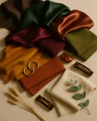
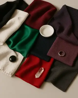
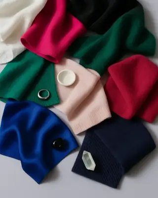
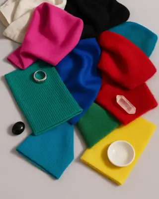
The “seasons” are a shorthand for groups of colors that share the same character. Spring colors are warm, clear and light. Summer colors are cool, soft and light. Autumn colors are warm, earthy and deeper. Winter colors are cool, sharp and high-contrast. Modern systems split each season into three, which gives the 12 seasons you’ll find in the quiz above: for example, a Soft Summer and a Cool Summer are both cool, but one wears muted, smoky colors and the other wears clearer, medium-intensity ones.
A short history: from Itten to 12 seasons
Johannes Itten, the painter and Bauhaus teacher, is credited with being the first to link color palettes to four types of people and to name those types after the seasons. His work on color is often described as the inspiration for what later became seasonal color analysis.
The method reached a mass audience around 1980. Bernice Kentner published “Color Me a Season” in 1978, with a system that focuses mainly on skin color and treats hair as secondary. In 1980 Suzanne Caygill published “Color: The Essence of You”, and Carole Jackson published “Color Me Beautiful”, the book that made the four seasons — Spring, Summer, Autumn, Winter — a household idea.
Four seasons turned out to be too coarse for many people, who felt they sat between two of them. In 1995 Mary Spillane and Christine Sherlock expanded the system to 12 palettes in “Color Me Beautiful’s Looking Your Best”. According to industry sources, Kathryn Kalisz developed the 12-season Sci\ART system in the 1990s, organizing the seasons around Munsell’s color dimensions. Today’s 12-season charts, including the one in Closie, descend from that idea: each season keeps its family, and the three subtypes are defined by which quality dominates.
Color theory basics: hue, value and chroma
In “A Color Notation” (1905), Albert H. Munsell argued that two dimensions can’t describe color properly and proposed three: hue (the color family — red, yellow, blue and so on), value (how light or dark it is) and chroma (how pure or saturated it is, as opposed to grayed). Seasonal color analysis borrows exactly these three axes and adds one practical translation: hue becomes temperature, warm or cool.
- Temperature (undertone): warm colors lean yellow-golden, cool colors lean blue-pink. Springs and Autumns are warm; Summers and Winters are cool.
- Value (depth): light seasons wear pale, airy colors; deep seasons need darker, richer ones to avoid looking washed out.
- Chroma (clarity): clear (bright) seasons wear saturated, clean colors; soft seasons wear colors with a gray veil.
How the Closie quiz turns your answers into a season
The quiz on this page uses the same logic as the Closie app, step by step:
- Undertone. Each of the two observations casts one vote: greenish veins or skin that tans easily vote warm; blue or purple veins or skin that burns and rarely tans vote cool; burning first and then tanning votes neutral. “Hard to tell” doesn’t vote. The majority wins. If there’s a tie or neither gives a vote, your hair color gives a hint: golden blonde, red and chestnut point warm; ash blonde, platinum, black and gray point cool; other shades count as neutral.
- Depth. The quiz averages the lightness of your hair and your skin. A high average means a light season, a low one means a deep season, and everything in between is medium.
- Contrast. It measures the difference in lightness between your hair and your skin. Your eyes count too, but with less weight. High contrast leads to the clear (bright) seasons; low contrast leads to the soft seasons.
- Season. Light coloring goes to Light Spring or Light Summer depending on undertone. Deep coloring goes to Deep Autumn or Deep Winter. In the medium range, contrast and undertone decide: warm and high contrast is Clear Spring; cool and high contrast is Bright Winter (with blue, green or gray eyes) or Cool Winter; low contrast gives Soft Autumn or Soft Summer; with a warm undertone and medium contrast, red or chestnut hair points to True Autumn, golden blonde to Warm Spring, and light brown to Warm Spring with clear eyes or True Autumn with hazel or brown eyes; a warm undertone with clearly visible contrast and clear eyes gives Clear Spring. A cool undertone with darker hair isn’t automatically winter: dark brown hair with light skin is medium contrast, so with a cool undertone it gives Cool Summer. Winter needs high contrast (black hair with light skin, or dark hair with very light skin), black hair, or dark hair together with dark brown eyes.
Your favorite colors don’t change your season — that’s taste, not coloring. They change what the result tells you: a favorite that’s in your palette can be worn near your face; one that isn’t is best worn lower down, in pants, shoes or a bag.
How to find your undertone
Undertone is the color that sits under the surface of your skin and stays the same whether you’re pale in February or tanned in August. It’s different from skin depth (how light or dark you are) and from surface redness. You can get a decent read on it at home with nothing but daylight and a few things from your closet.
- 1
Find the right light
Stand facing a window during the day, without direct sun on your face. Avoid warm bulbs and colored walls nearby — they tint everything.
- 2
Take off makeup and tinted products
Foundation, bronzer and tinted sunscreen hide the very thing you’re looking at. Pull hair dyed in a strong shade away from your face or cover it with a white towel.
- 3
Compare snow white and ecru
Hold a bright white top under your chin, then an ivory or ecru one. If bright white looks clean and ecru makes you look yellowish, you probably lean cool. If ecru looks softer and bright white looks harsh, you probably lean warm.
- 4
Compare silver and gold
Put on a silver piece, then a gold one, or hold them against your jawline. Notice which one makes your skin look even and which one makes it look gray or sallow. Looking equally good in both often means neutral.
- 5
Think about the sun
Skin that tans easily often (not always) goes with a warm undertone; skin that burns and stays pink more often goes with a cool one.
- 6
Count the votes
Two or three answers on the same side give you a fairly clear lean. A split result usually means neutral — which is common and not a problem. The quiz above counts the votes for you.
What about the popular vein test? It’s the weakest of the bunch. Veins look bluish or greenish because of how light travels through skin — the result depends on the depth and size of the vessel and on how our eyes perceive the reflected light, not only on skin color. The physics is described in Kienle et al., “Why do veins appear blue?” (Applied Optics, 1996). The Closie quiz still asks about veins, but it’s one vote out of three, and “not sure” is a perfectly good answer.
Warm vs cool undertone (and neutral, and olive)
Most confusion about color analysis starts here, so it’s worth being precise. A warm undertone has a golden, peachy or yellowish base. A cool undertone has a pink, rosy or bluish base. A neutral undertone sits between the two and can borrow from both sides — usually the softer versions.
Metals
- Warm undertone
- Gold looks even, silver looks gray
- Cool undertone
- Silver looks fresh, gold looks yellow
- Neutral undertone
- Both look fine
White
- Warm undertone
- Ivory, cream, ecru
- Cool undertone
- Snow white, soft optic white
- Neutral undertone
- Off-white
Sun
- Warm undertone
- Tans more easily
- Cool undertone
- Burns more easily
- Neutral undertone
- Mixed
Easy colors
- Warm undertone
- Camel, rust, olive, coral
- Cool undertone
- Navy, raspberry, cool gray, plum
- Neutral undertone
- Taupe, soft teal, muted rose
Seasons
- Warm undertone
- Spring, Autumn
- Cool undertone
- Summer, Winter
- Neutral undertone
- Often a soft or clear season
| Warm undertone | Cool undertone | Neutral undertone | |
|---|---|---|---|
| Metals | Gold looks even, silver looks gray | Silver looks fresh, gold looks yellow | Both look fine |
| White | Ivory, cream, ecru | Snow white, soft optic white | Off-white |
| Sun | Tans more easily | Burns more easily | Mixed |
| Easy colors | Camel, rust, olive, coral | Navy, raspberry, cool gray, plum | Taupe, soft teal, muted rose |
| Seasons | Spring, Autumn | Summer, Winter | Often a soft or clear season |
Olive skin deserves a note. It looks greenish-beige and often gets labeled warm because it tans easily, yet many people with olive skin find bright gold and orange unflattering. In practice olive skin often reads as neutral to slightly warm, and it tends to look best in deep greens, terracotta and warm white rather than snow white — which is exactly what the Closie quiz says when you pick “olive”.
A useful way to see temperature in clothes: almost every color comes in a warm and a cool version. Warm red leans tomato and brick; cool red leans raspberry and wine. Warm green is olive and moss; cool green is emerald and sea green. Warm white is ivory; cool white is snow white. You rarely need to give up a whole color — just switch to the version that matches your temperature.
Undertone test vs season: why undertone alone isn’t your season
An undertone test tells you one thing: warm, cool or neutral. Your season needs two more: how light or deep your coloring is, and how much contrast there is between your hair, eyes and skin. Two people with the same cool undertone can land in very different seasons. Platinum hair, very light skin and blue eyes point to Light Summer. Black hair, light skin and blue eyes point to Bright Winter. Same undertone, opposite wardrobes: pastels for one, black and white for the other.
This is also why a neutral undertone isn’t a dead end. In the Closie quiz, a neutral undertone with low contrast leads to Soft Autumn or Soft Summer (your eye color tips the balance), and with high contrast to Clear Spring or Bright Winter (very dark hair tips it toward winter).
The at-home drape test, step by step
Professional analysts use sets of colored fabric drapes. You can run a simplified version with what you already own. It won’t be as precise, but it’s a good way to check your quiz result.
- 1
Prepare
Daylight from a window, no makeup, hair pulled back or covered with a white towel. Put a gray or white T-shirt on so your own clothes don’t interfere.
- 2
Gather pairs
Pick fabrics in pairs that differ in one quality only: snow white vs ecru (temperature), navy vs camel (temperature), black vs chocolate brown (depth), fuchsia vs dusty rose (chroma).
- 3
Drape under your chin
Hold each fabric across your chest, right under your face, for a few seconds. Use a mirror or a photo taken in the same light.
- 4
Watch your face
Look at the skin under your eyes, around your nose and along your jaw. A good color evens things out; a poor one deepens shadows, adds redness or makes the skin look gray or yellow.
- 5
Write it down
Note which side of each pair wins. Mostly ecru and camel point warm; mostly snow white and navy point cool. If chocolate beats black, you’re probably not a Winter; if fuchsia beats dusty rose, you probably need clearer colors.
- 6
Compare with your result
Check your notes against your season page. If they disagree, try a neighboring season — the season pages explain how each one differs from its closest neighbors.
The 12 seasons at a glance
- Temperature
- warm-neutral
- Value
- light
- Chroma
- medium
- Neutrals
- ivory, beige, camel
- Accents
- peach, coral, mint, light blue
- Avoid near your face
- black, burgundy
- Metal
- light gold
- Temperature
- warm
- Value
- medium
- Chroma
- medium
- Neutrals
- cream, camel, beige
- Accents
- coral, sunny yellow, turquoise
- Avoid near your face
- black, cool gray
- Metal
- yellow gold
- Temperature
- warm-neutral
- Value
- medium
- Chroma
- clear
- Neutrals
- ivory, navy, camel
- Accents
- coral, turquoise, emerald, cobalt
- Avoid near your face
- dusty, muted shades
- Metal
- polished gold
- Temperature
- cool-neutral
- Value
- light
- Chroma
- soft
- Neutrals
- off-white, cool gray, taupe
- Accents
- powder pink, lavender, light blue
- Avoid near your face
- black, orange
- Metal
- silver
- Temperature
- cool
- Value
- medium
- Chroma
- medium
- Neutrals
- navy, cool gray, off-white
- Accents
- raspberry, sea green, plum
- Avoid near your face
- orange, mustard
- Metal
- silver, white gold
- Temperature
- cool-neutral
- Value
- medium
- Chroma
- soft
- Neutrals
- taupe, graphite, off-white
- Accents
- powder pink, sea green, lavender, plum
- Avoid near your face
- black, snow white, mustard
- Metal
- matte silver
- Temperature
- warm-neutral
- Value
- medium
- Chroma
- soft
- Neutrals
- taupe, ecru, mocha, khaki
- Accents
- olive, peach, sea green, terracotta
- Avoid near your face
- black, fuchsia, snow white
- Metal
- brushed gold
- Temperature
- warm
- Value
- medium
- Chroma
- medium
- Neutrals
- camel, chocolate, cream
- Accents
- rust, olive, mustard, terracotta
- Avoid near your face
- icy pink, cool gray
- Metal
- gold, bronze
- Temperature
- warm-neutral
- Value
- deep
- Chroma
- medium
- Neutrals
- chocolate, black, cream
- Accents
- bottle green, rust, burgundy, mustard
- Avoid near your face
- pastels, icy pink
- Metal
- antique gold
- Temperature
- cool-neutral
- Value
- deep
- Chroma
- clear
- Neutrals
- black, snow white, ink navy, graphite
- Accents
- burgundy, emerald, red, plum
- Avoid near your face
- beige, peach, camel
- Metal
- silver
- Temperature
- cool
- Value
- medium
- Chroma
- clear
- Neutrals
- snow white, black, navy
- Accents
- fuchsia, cobalt, emerald, icy pink
- Avoid near your face
- camel, mustard, orange
- Metal
- silver, platinum
- Temperature
- cool-neutral
- Value
- medium
- Chroma
- clear
- Neutrals
- snow white, black, graphite
- Accents
- fuchsia, cobalt, turquoise, red, lemon
- Avoid near your face
- dusty, muted shades
- Metal
- polished silver
| Season | Temperature | Value | Chroma | Neutrals | Accents | Avoid near your face | Metal |
|---|---|---|---|---|---|---|---|
| Light Spring | warm-neutral | light | medium | ivory, beige, camel | peach, coral, mint, light blue | black, burgundy | light gold |
| Warm Spring | warm | medium | medium | cream, camel, beige | coral, sunny yellow, turquoise | black, cool gray | yellow gold |
| Clear Spring | warm-neutral | medium | clear | ivory, navy, camel | coral, turquoise, emerald, cobalt | dusty, muted shades | polished gold |
| Light Summer | cool-neutral | light | soft | off-white, cool gray, taupe | powder pink, lavender, light blue | black, orange | silver |
| Cool Summer | cool | medium | medium | navy, cool gray, off-white | raspberry, sea green, plum | orange, mustard | silver, white gold |
| Soft Summer | cool-neutral | medium | soft | taupe, graphite, off-white | powder pink, sea green, lavender, plum | black, snow white, mustard | matte silver |
| Soft Autumn | warm-neutral | medium | soft | taupe, ecru, mocha, khaki | olive, peach, sea green, terracotta | black, fuchsia, snow white | brushed gold |
| True Autumn | warm | medium | medium | camel, chocolate, cream | rust, olive, mustard, terracotta | icy pink, cool gray | gold, bronze |
| Deep Autumn | warm-neutral | deep | medium | chocolate, black, cream | bottle green, rust, burgundy, mustard | pastels, icy pink | antique gold |
| Deep Winter | cool-neutral | deep | clear | black, snow white, ink navy, graphite | burgundy, emerald, red, plum | beige, peach, camel | silver |
| Cool Winter | cool | medium | clear | snow white, black, navy | fuchsia, cobalt, emerald, icy pink | camel, mustard, orange | silver, platinum |
| Bright Winter | cool-neutral | medium | clear | snow white, black, graphite | fuchsia, cobalt, turquoise, red, lemon | dusty, muted shades | polished silver |
Each subtype is named after its dominant quality. In Light Spring and Light Summer it’s value; in Warm Spring, True Autumn, Cool Summer and Cool Winter it’s temperature; in Clear Spring and Bright Winter it’s chroma (clarity); in Soft Summer and Soft Autumn it’s low chroma; in Deep Autumn and Deep Winter it’s depth. That’s why neighbors across families — Soft Summer and Soft Autumn, or Clear Spring and Bright Winter — often look more alike than two seasons in the same family.
Wearing colors outside your palette
Your palette isn’t a list of banned colors. It’s about distance from your face. The colors closest to your face — tops, scarves, collars, earrings — have the biggest effect. Pants, skirts, shoes and bags have almost none. That’s why the Closie palette has two parts: eight colors to wear near your face and four to wear further away.
- Move it down. Love mustard but you’re a Summer? Wear mustard pants or a mustard bag with a top from your palette.
- Add a buffer. A collar, scarf or necklace in one of your colors between your face and the off-palette top does a lot of the work.
- Change the version, not the color. A Winter who wants beige can try cool taupe; an Autumn who wants pink can try terracotta-rose.
- Use texture. Matte knits soften a too-bright color; satin and sheen make a color look clearer. Soft seasons usually prefer matte, clear seasons can handle shine.
Common mistakes
- Judging under artificial light. Warm bulbs make everyone look warmer; cool LEDs do the opposite. Always check in daylight.
- Trusting your phone screen. Phone cameras and screens adjust color automatically, so a selfie can shift your undertone in either direction. Compare in a mirror or take photos in the same light, one after another.
- Answering with dyed hair. The quiz asks about the hair color you have today, but if you dye it far from your natural shade, try the quiz twice — once with your current color, once with your natural one — and compare.
- Testing with a tan or makeup on. A tan changes depth for a few weeks; foundation and bronzer change temperature. Neither changes your undertone.
- Confusing depth with temperature. Dark hair doesn’t make you cool, and blonde hair doesn’t make you warm. Golden blonde is warm, ash blonde is cool; chestnut is warm, black is cool.
- Treating your season as a uniform. The palette is a starting point. If a color outside it makes you feel good and you wear it often, keep it — just think about where you place it.
Building a capsule wardrobe in your palette
A palette makes a capsule wardrobe much easier, because it settles the hardest question — which neutrals to build on. Pick two or three neutrals from your palette for the big pieces (coat, pants, knitwear), then one or two accents for tops and accessories. Everything will mix, because everything shares the same temperature and clarity.
- Summers: navy or graphite coat, cool gray knit, off-white shirt; accents in powder pink, sea green or plum.
- Winters: black or ink navy coat, snow white shirt; accents in fuchsia, cobalt or emerald.
- Autumns: camel or chocolate coat, cream knit, olive pants; accents in rust, mustard or bottle green.
- Springs: camel or light beige coat, ivory top; accents in coral, turquoise or sunny yellow.
For a seasonal list of pieces, see the winter capsule wardrobe — then swap its colors for the ones in your palette.
What an online quiz can’t replace
Let’s be clear about what this quiz is. It’s a short, structured self-check based on your answers. It doesn’t analyze a photo, it doesn’t see your skin, and it isn’t the same as an in-person session with a color analyst who drapes dozens of fabrics under controlled light. It also depends on how you answer: two people with the same coloring can describe themselves differently.
Seasonal color analysis itself is a styling method, not an exact science. Different systems draw the lines between seasons in slightly different places, and published research on how consistently analysts agree is limited. Treat your result as a well-reasoned starting point: check it with the drape test, read your season page and its neighbors, and trust what you see in the mirror in daylight.
Your colors in the Closie app
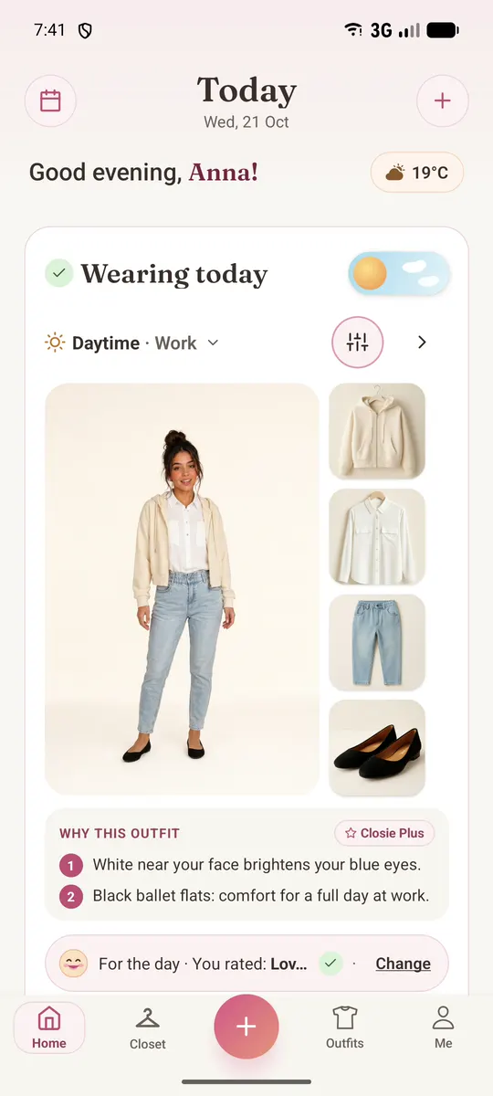
Closie is a wardrobe and outfit app for iPhone and Android. The same quiz lives in the app under Me → Your colors, and saving your palette there is free. Once your clothes are in Closie, you’ll see how many of them are in your palette, how many are in your favorite colors and how many fall outside it.
- The free outfit of the day skips colors you marked as “I don’t wear” whenever you have another option.
- Closie Plus matches the outfits it puts together from your wardrobe to your whole palette.
- You can change your answers anytime, and the palette updates.
One naming note: on this site we use the names people search for most. In the app, Clear Spring is called Bright Spring and True Autumn is called Warm Autumn — same seasons, same palettes.