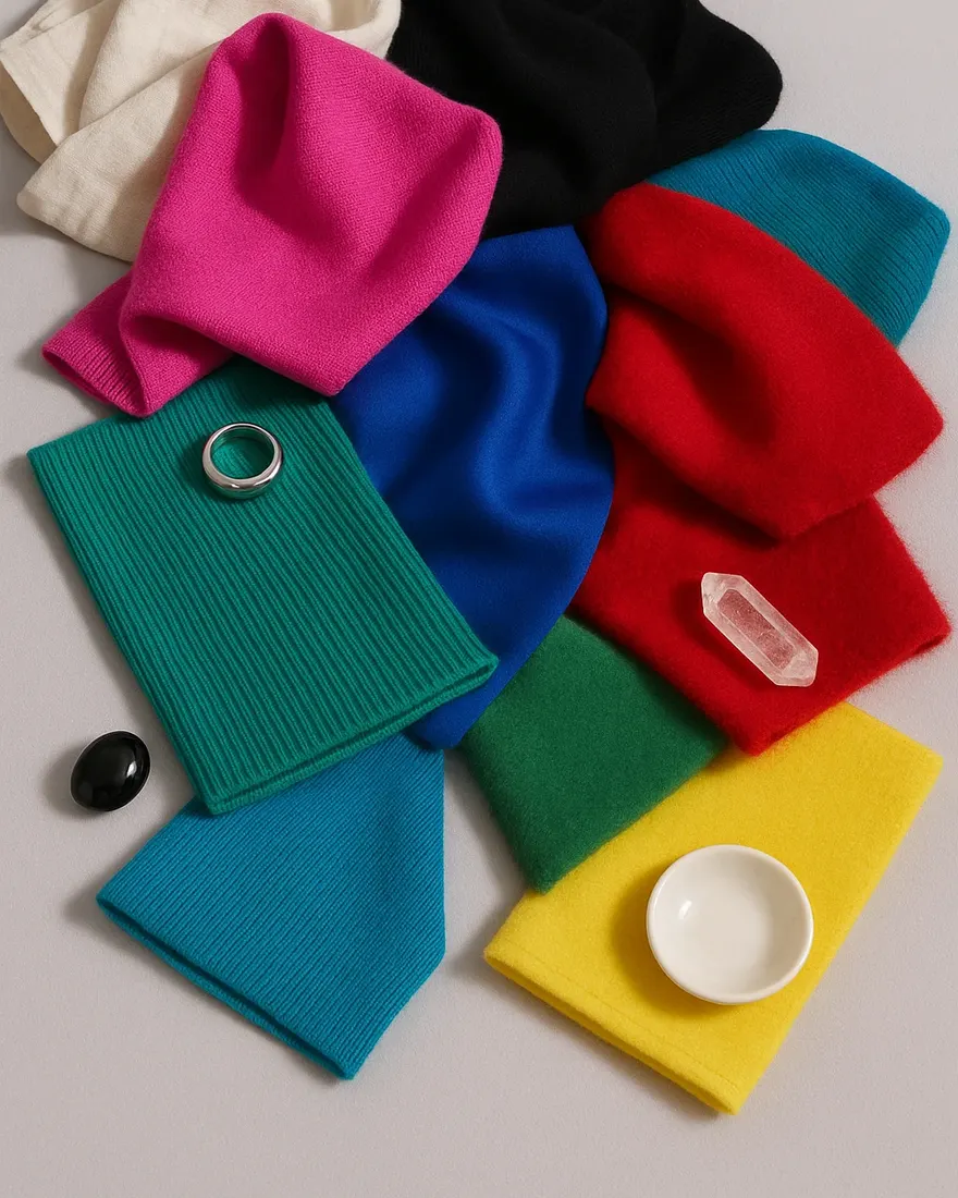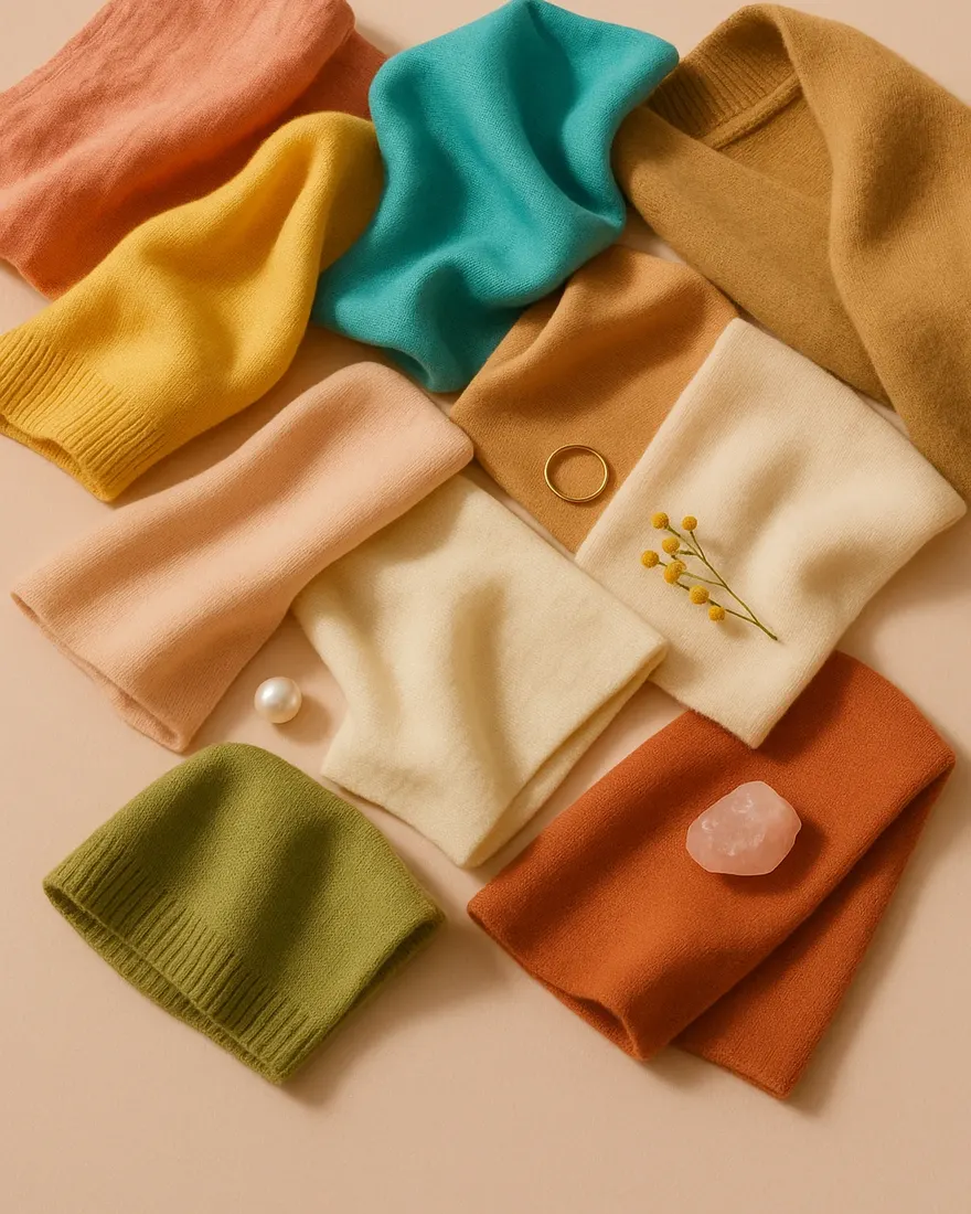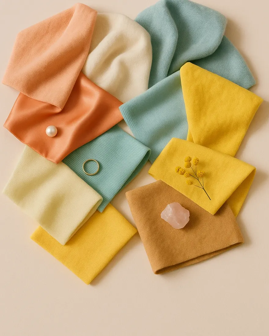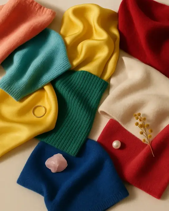
Clear Spring color palette at a glance
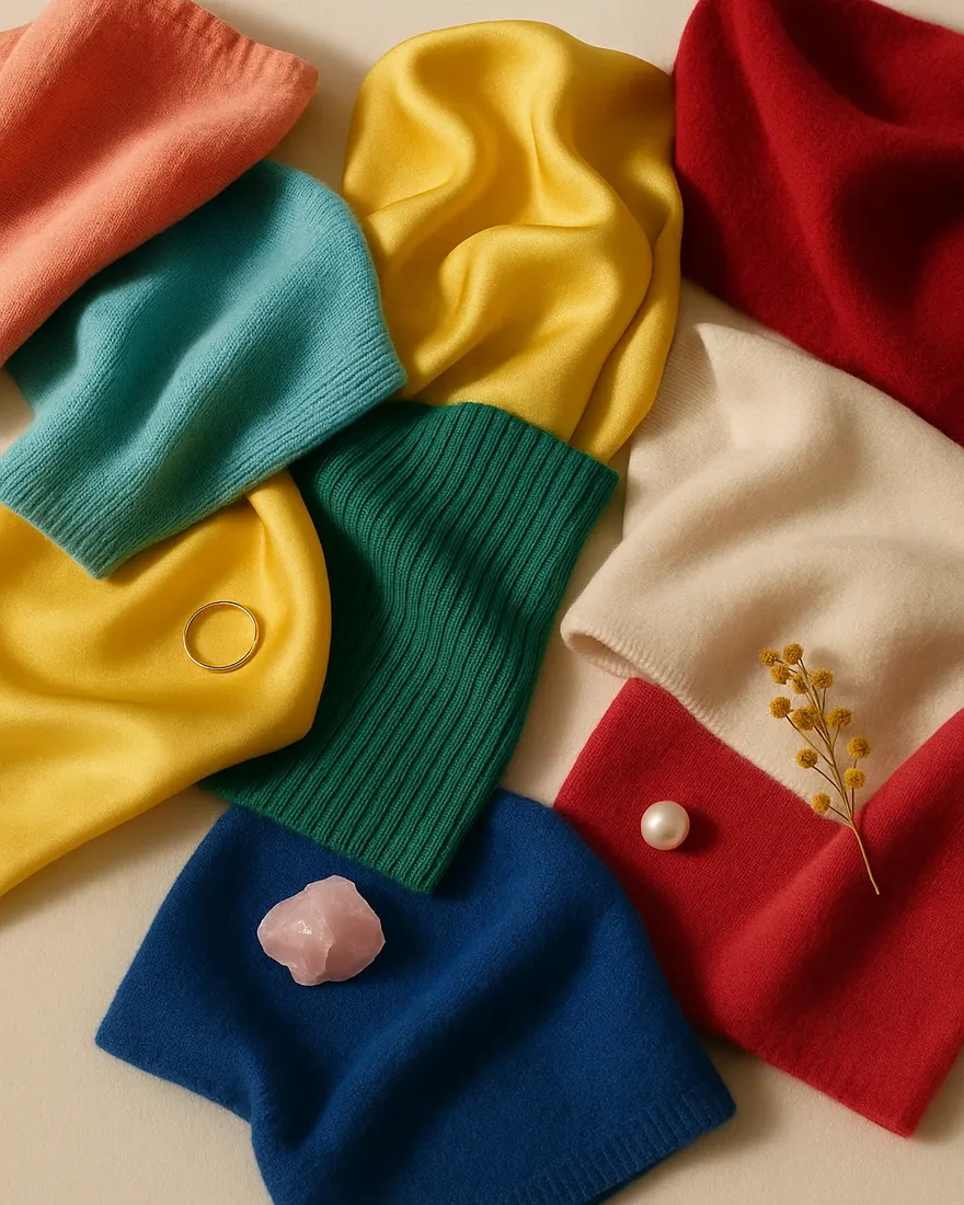
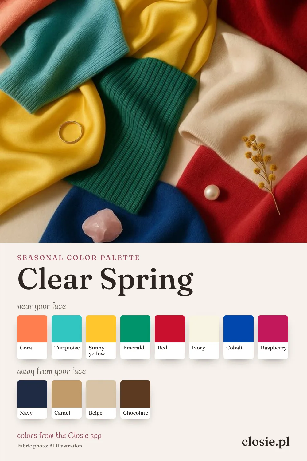
The Clear Spring color palette has the highest saturation of all springs. Think of a tropical garden: coral, turquoise, emerald, sunny yellow, true red, raspberry and cobalt, with ivory as the light neutral. Every color is clean — no grey, no dust.
In the Closie app the palette lists eight colors for near the face — coral, turquoise, sunny yellow, emerald, red, ivory, cobalt and raspberry — and navy, camel, beige and chocolate for further away.
Bright Spring vs Clear Spring: same season
Clear Spring and Bright Spring are two names for the same type. The Closie app uses “Bright Spring”; many analysts say “Clear”. Both point to the same defining trait: high chroma, meaning pure, saturated colors with strong contrast.
White, black and grey for a Clear Spring
- White: ivory or soft white. Pure optical white can work in small doses thanks to your contrast.
- Black: possible as a sharp accent, but navy is the better everyday dark neutral.
- Grey: clear light grey or charcoal sparingly; avoid dull, dusty mid-greys.
- Brown: chocolate and camel, especially in leather.
How to wear colors outside your palette
If you own a lot of muted colors, add clarity rather than replacing everything. A taupe coat becomes yours with a turquoise scarf; a khaki skirt works with a coral top; a dusty pink dress gets help from a true red lip. The goal is one clear, saturated note near your face.
Hair color for Clear Spring
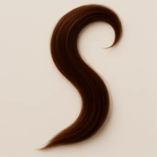
Rich warm browns, chocolate, golden brown and bright golden blonde with darker roots keep your natural contrast. Very ashy or dull, flat shades reduce it. If you go lighter, keep your brows defined so the face doesn’t lose its contrast.
Fabrics and patterns
Smooth, slightly shiny fabrics — silk, satin, polished cotton, crisp poplin — show your colors at their best. You can carry bold patterns: color blocking, graphic florals, clear stripes. Washed-out prints and heathered fabrics flatten you.
Am I a Clear Spring? Four quick checks
- Your hair is noticeably darker than your skin.
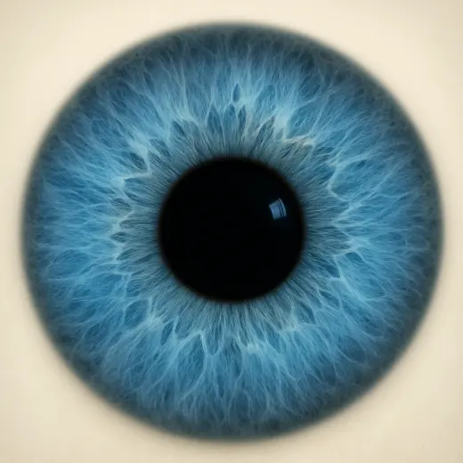
- Bright turquoise or coral make your eyes look clearer.
- Dusty pink, taupe and khaki make you look tired.
- Gold and ivory still feel a little warmer and better than silver and pure white.
High contrast plus a warm or neutral undertone is exactly what the Closie test looks for: in the logic behind the free color analysis quiz, a warm undertone with high contrast leads to Clear Spring, and so does a clearly visible contrast (darker hair, light skin) when your eyes are clear blue, green or grey. A cool undertone with the same contrast leads to Bright Winter.
Five color pairings that work
- Navy + ivory + coral — crisp and polished.
- Turquoise + camel — vivid but grounded.
- True red + ivory — classic, never boring.
- Emerald + cobalt — bold color blocking.
- Raspberry + navy — a cooler-leaning option within your palette.
Common mistakes
- Dressing in “safe” beige and grey and feeling invisible.
- Choosing muted, dusty fashion colors instead of clear ones.
- Pale, low-contrast makeup that disappears on your face.
- Going fully black for evening — navy or true red work better.
Same color, different shade: a shopping table
Pink
- Choose
- raspberry, coral pink
- Skip near the face
- dusty rose, powder pink
Blue
- Choose
- cobalt, turquoise
- Skip near the face
- greyish denim, slate
Green
- Choose
- emerald, bright jade
- Skip near the face
- olive, khaki
Red
- Choose
- true red, coral red
- Skip near the face
- brick, rust
Neutral
- Choose
- ivory, navy
- Skip near the face
- taupe, mocha
| Color family | Choose | Skip near the face |
|---|---|---|
| Pink | raspberry, coral pink | dusty rose, powder pink |
| Blue | cobalt, turquoise | greyish denim, slate |
| Green | emerald, bright jade | olive, khaki |
| Red | true red, coral red | brick, rust |
| Neutral | ivory, navy | taupe, mocha |
How to check if you are a Clear Spring at home
You don’t need professional drapes for a first check. Stand facing a window in daylight, without makeup, hair pulled back, wearing something neutral. Hold each pair of fabrics (tops, scarves, towels) under your chin one after the other and look at your skin, not at the fabric: are shadows softer, is the skin more even, do your eyes look clearer?
- Turquoise vs muted teal: turquoise should make your eyes brighter; teal may look dull.
- Ivory vs beige: ivory should look crisp; beige may make you look tired.
- Coral vs fuchsia: coral should look natural; fuchsia a little cold.
If your answers keep pointing the same way, you have a strong hint. If they are mixed, take the free color analysis quiz — it combines your hair, eye and skin answers with three undertone tests, the same way the Closie app does.
Clear Spring in a fall–winter 2026/2027 wardrobe
Winter is a good season for your jewel-like brights. Pair a dark, clean base (navy, chocolate) with one saturated color near the face.
- A navy or camel coat.
- Emerald and coral knitwear.
- An ivory turtleneck for layering.
- A true red dress or lipstick for the holidays.